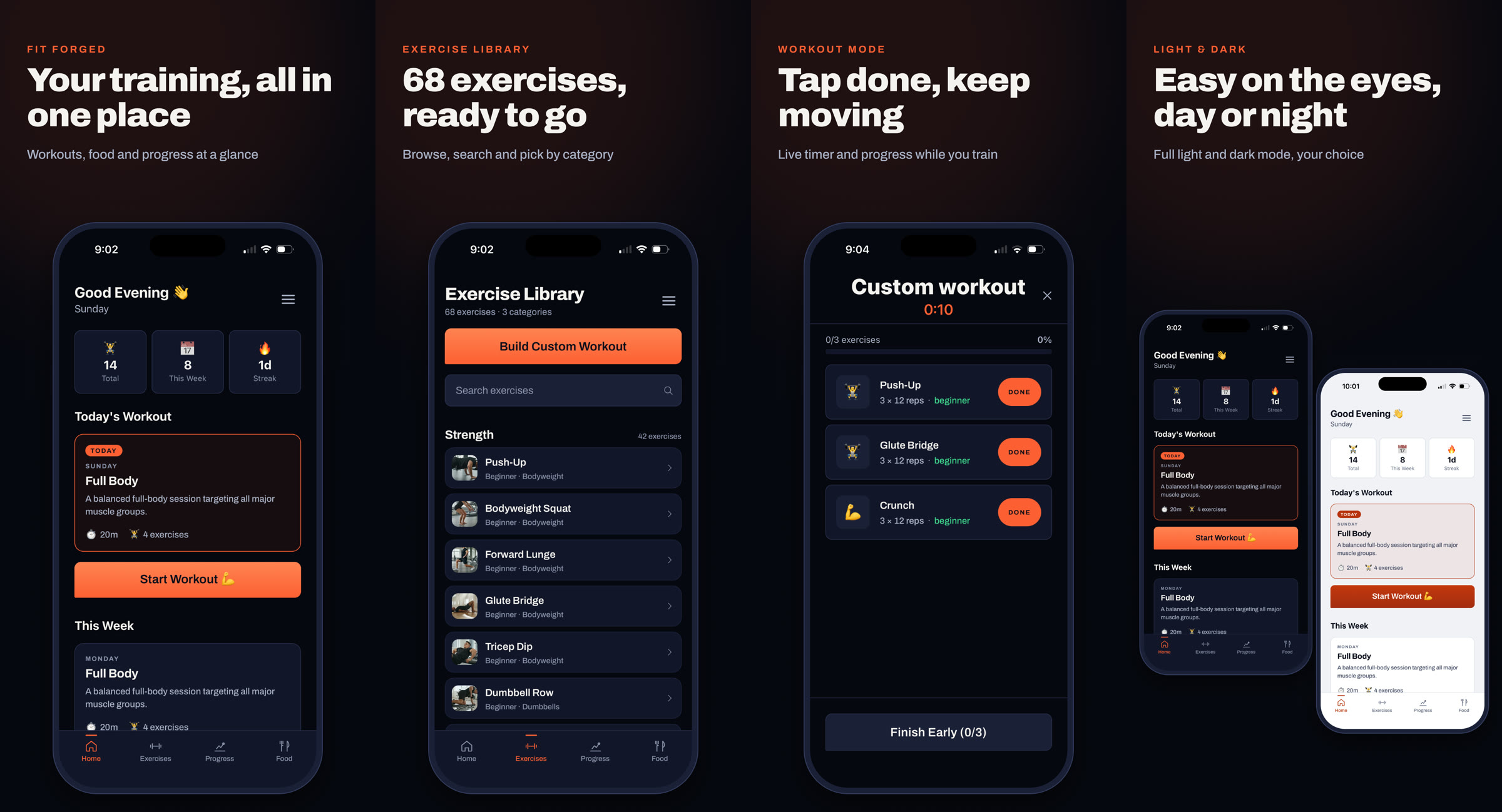
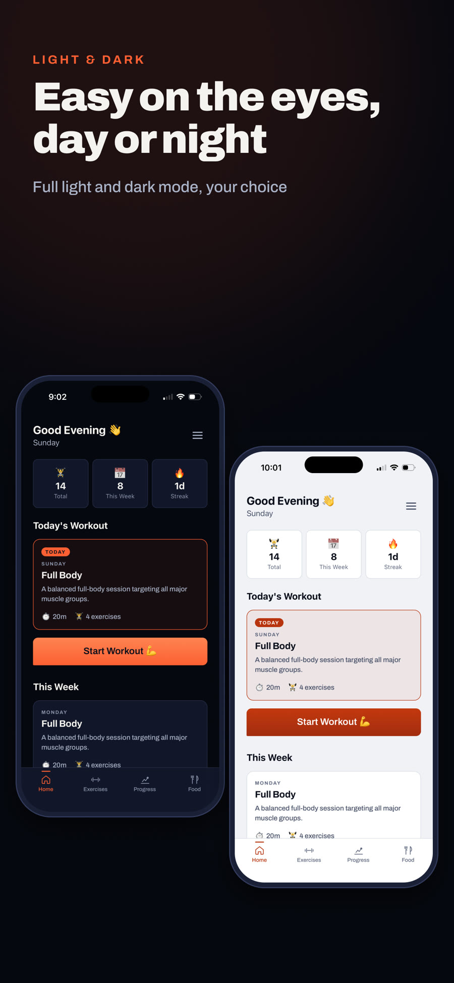
The App Store set: home, the exercise library, workout mode, and the same home screen in light and dark.
Case Study: Product Design, Build & Launch
Fit Forged: fit-forged.app
The App Store set: home, the exercise library, workout mode, and the same home screen in light and dark.
01: Overview
Most fitness apps hand you a catalogue and expect you to program your own training. That is exactly the moment people stall: standing in a gym, or in a living room at 6am, scrolling for a plan instead of moving.
Fit Forged answers that with a planned week. Open the app and today's session is already there, with how long it takes and what it targets. Around it sit the things that keep you going: a library that teaches each movement properly, a way to build your own session when you want one, a photo food log, and progress you can see.
I owned all of it: research, flows, wireframes, the design system, the React Native build, the backend, App Store submission and the marketing site.
My Role
Solo Designer & Builder
Product strategy, UX, UI, design system, engineering, release and launch marketing
Timeline
2026
Version 1.0 live on the App Store 14 September 2026, 1.0.2 five days later
Platform
iOS, Health & Fitness
React Native and Expo, Supabase for auth, data and storage, shipped through EAS
Core Features
Five, Kept Tight
Planned workouts, exercise library, custom workout builder, photo food log, progress
Design
Figma, Ink / Ember / Quench
Greyscale wireframes, a 35 screen task flow, and a token-based system in light and dark
Business Model
Free
No paywall and no premium tier, written into the terms as free forever
02: The Problem
Four friction points shaped the scope. Each one became a feature, and anything that didn't answer one of them stayed out of version one.
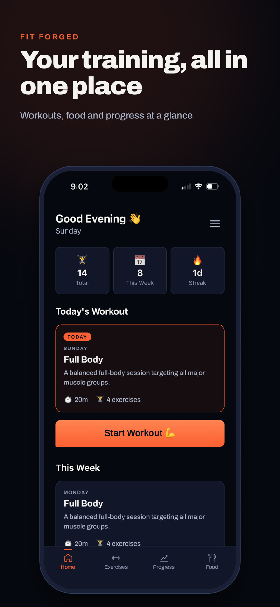
The effort before a workout is choosing it. So the home screen leads with today's session and one button, Start Workout. Everything else is secondary.
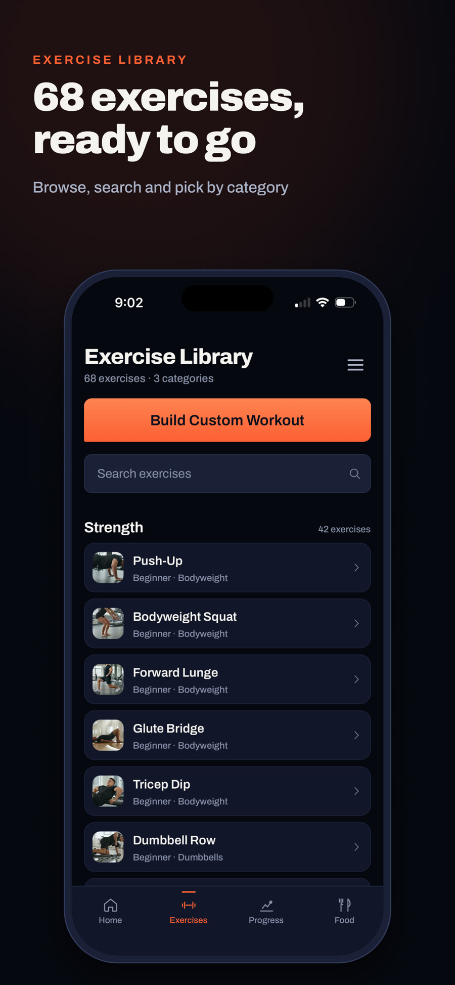
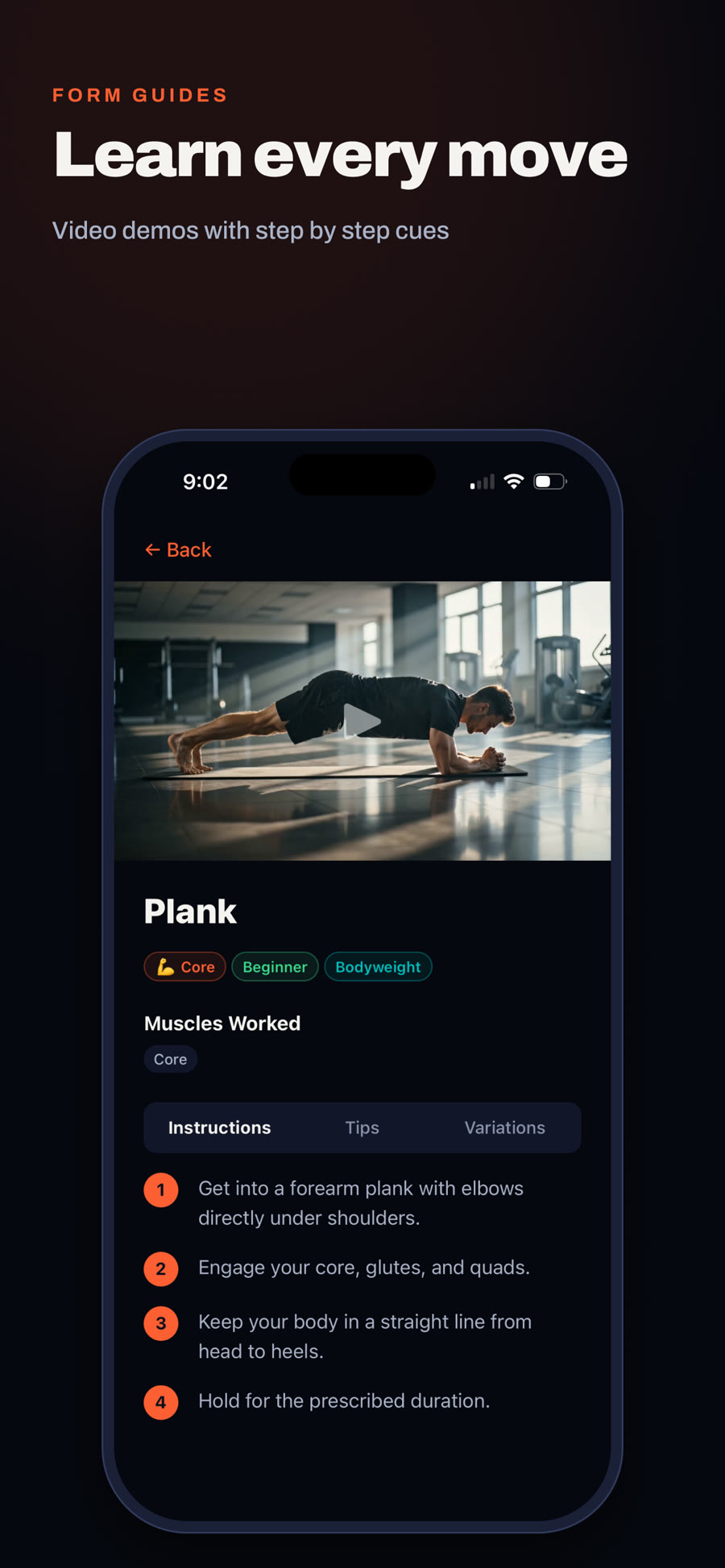
A name and a rep count leaves people guessing at the gym. Every one of the 68 exercises has a video demo, step by step instructions, tips and variations.
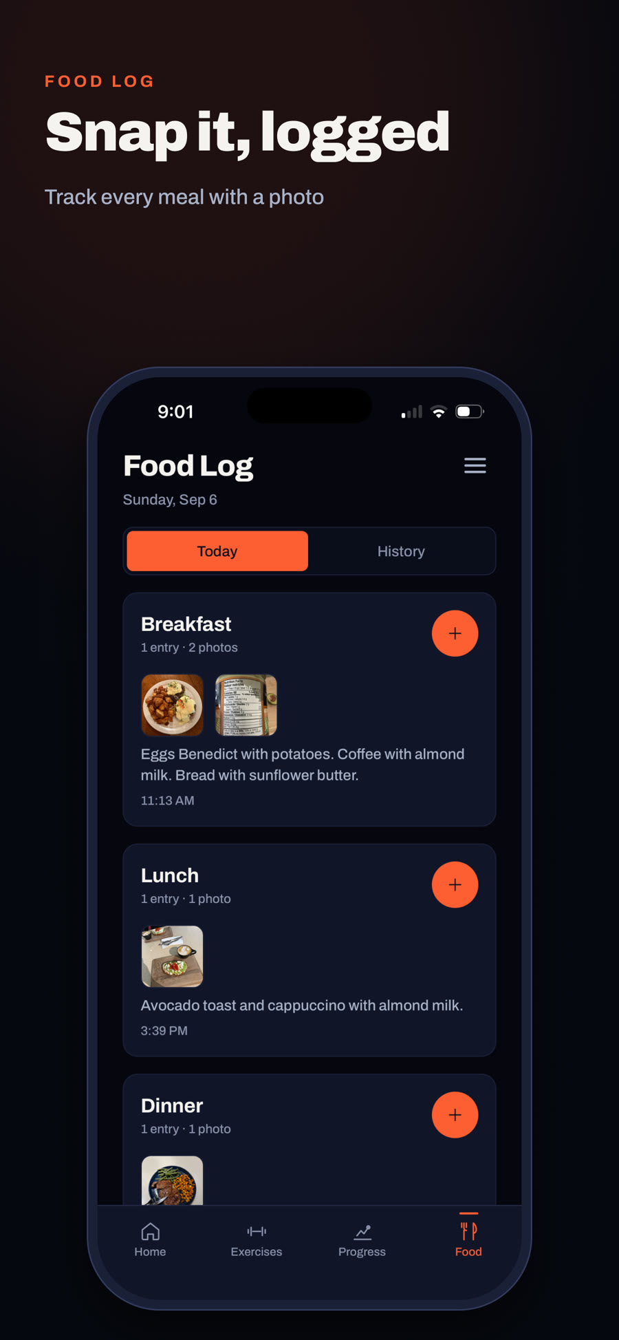
Weighing and searching every ingredient is the step people quit. The food log is photo-first: snap the meal, add a note if you like, and the day builds itself.
Totals, this week's count and a streak sit at the top of home, so showing up is the thing the app rewards, not how heavy you lift.
03: Design Process
Every feature started as a greyscale wireframe in Figma, sized to a real phone, before a line of code. Keeping colour out of it kept the conversation on hierarchy: what the one main action is, and what can wait.
I then mapped the whole app as a single task flow: 35 screens, six decision points and seven lanes (get started, train, exercise library, log food, progress, account and replan), all hanging off the home screen.
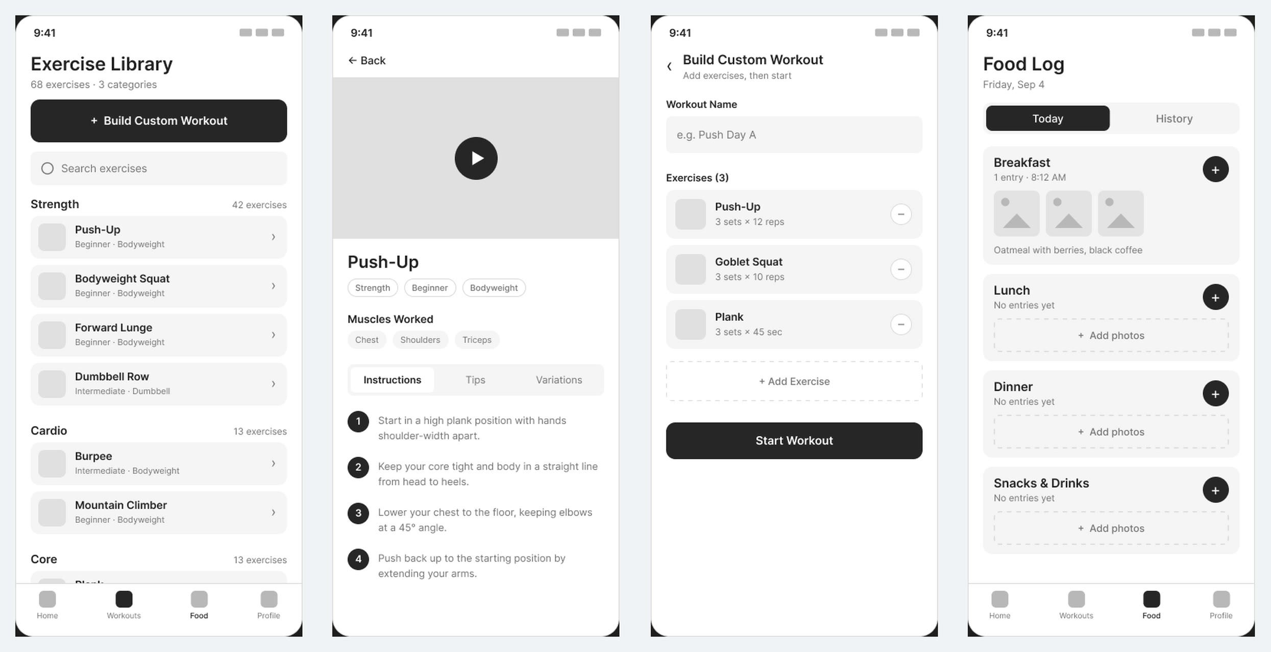
Wireframes for the exercise library, exercise detail, custom builder and food log.
The first build had Home, Workouts, Food and Profile. Adding the exercise library meant something had to give, so the tabs became Home, Exercises, Progress and Food, and Settings moved behind a menu in the top corner of every tab. Things you do daily got the tabs; things you do once a month did not.
Early testing showed a plain text match failing on "push up" against "Push-Up". Search now matches words regardless of punctuation and jumps back to the top as results shrink, so a short list never leaves you staring at an empty screen.
04: Design System
The name set the palette. Ink is the dark ground, Ember is the heat of effort and carries every primary action, and Quench is the teal of cooling down, used for success and rest. Type is Archivo throughout, from a black weight on headlines down to labels.
Light mode forced the most interesting decision. The true Ember orange only reaches 3.06:1 against white, which fails as text, so on light grounds a deeper ember (#B8330E) takes over every ember role. The brand reads the same; the contrast passes.
Ink 900
#06070F
Ink 700
#12162A
Ember 500
#FD5F33
Ember on light
#B8330E
Quench 500
#03BBBB
Paper 50
#F1F2F7
05: The App
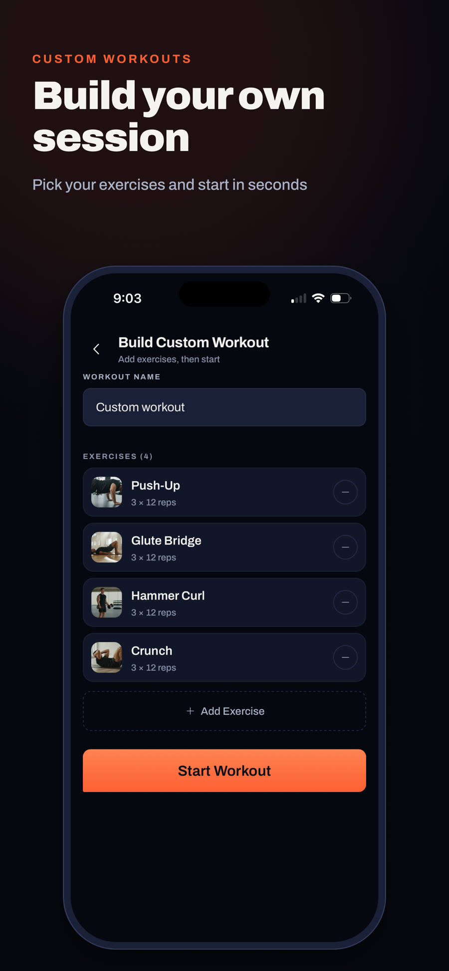
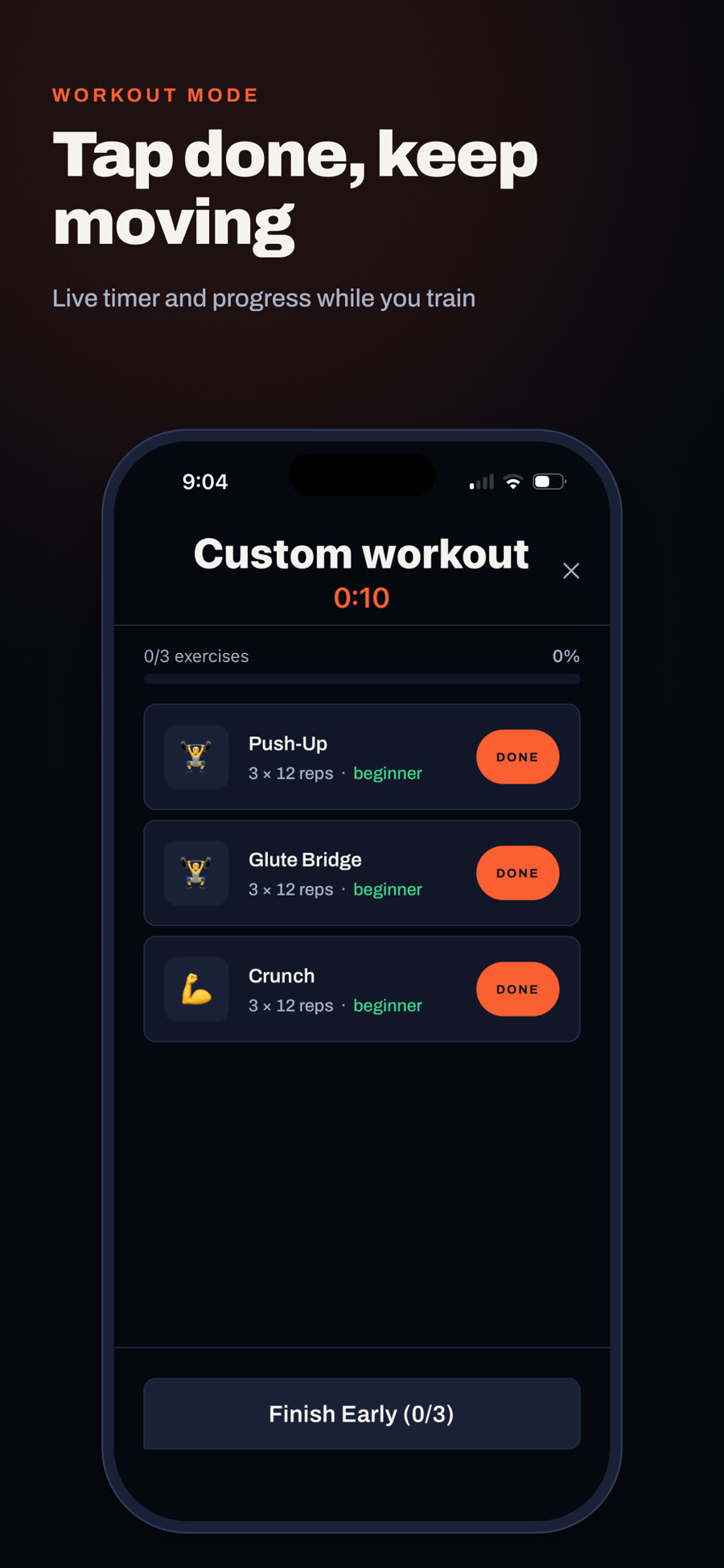
The App Store screenshots double as a tour. Each one makes a single promise in a few words, because that is how long anyone looks at a store listing.
06: Build & Release
Getting from a working build to a live listing is where a lot of the real UX decisions turned up. The ones that mattered most:
Stack
React Native with Expo, Supabase for accounts, workouts, food entries and private photo storage with per-user access rules. Colour, type roles and custom icons are shared tokens, so a screen can't quietly invent its own style.
Sign in
Sign-in happens in the app with no browser hand-off. Apple sign-in sits alongside Google on purpose: App Store rules require a privacy-preserving option whenever a third-party login is offered. Both buttons share one component in the app's own type, rather than Apple's stock button, which can't be restyled.
App Review
The first submission was rejected for offering sign-up without an in-app way to delete the account. I designed a Delete Account flow in Settings that lists exactly what goes, says it can't be undone and asks you to type DELETE, then rewrote the privacy policy to match.
Onboarding
Signup emails originally pointed at a dead localhost link. They now go through a small bridge page on the website that opens the app if it's installed and offers the App Store if it isn't, so the link works on a desktop too.
Feedback
Settings has a feedback sheet that attaches the app version and build automatically, since nobody knows their own build number, and lands in the same inbox as the website's contact form.
07: Launch
fit-forged.app is a scroll-driven film: one continuous shot moving forward from 4am to dawn, passing a single ember-lit object in each room while everything else stays in shadow. It is the app's whole pitch told without a feature list: one thing lit, everything you didn't have to choose left in the dark.
Below the film sit a five-day streak strip, free workout guides written for search, and one call to action everywhere: Download for iOS.
Visit fit-forged.app ↗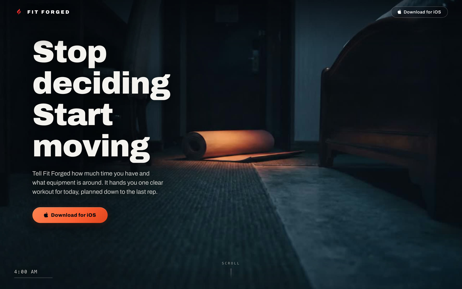
The first frame of the film: 4am, one lit mat, and the launch line, stop deciding, start moving.
08: Outcomes
Fit Forged is new, so these are shipping numbers rather than growth numbers. Every one of them can be checked on the App Store today.
1.0
Live on the App Store
14 Sept 2026
3
Versions Shipped
in the First Week
68
Exercises with
Video Demos
35
Screens Mapped
in the Task Flow
09: Reflection
App Review is a design input, not a final hurdle. Account deletion, the second sign-in option and the privacy policy wording all came from store rules, and they were far cheaper to design in than to bolt on after a rejection.
Design systems drift in quiet ways. A few labels were set in bold without naming the font, so they fell back to the system typeface and nobody noticed on a simulator. Moving everything onto shared type roles and single components is what stopped it happening again.
Getting it into hands. The name is shared with other fitness brands, which makes search a slow road, so the focus is the App Store listing, the guides and social. Next in the app itself: the first real reviews, and using what people send through the feedback sheet to decide what version two is for.